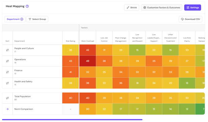
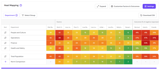
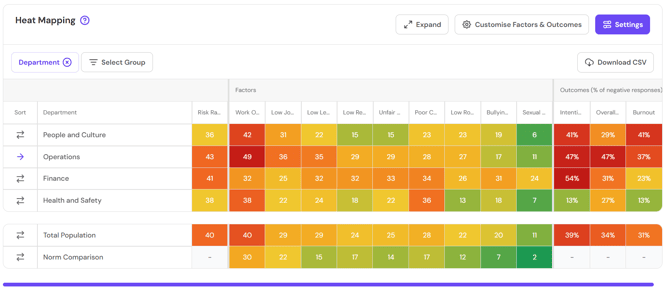
The Heat Mapping tab provides a comparison of risk ratings and hazard exposure scores across demographic groups.
Within the visualisation, apply the filter you want to use to compare results.
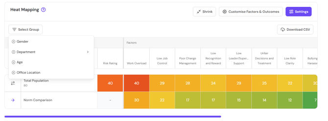
You can also stack filters to compare subsets of data.
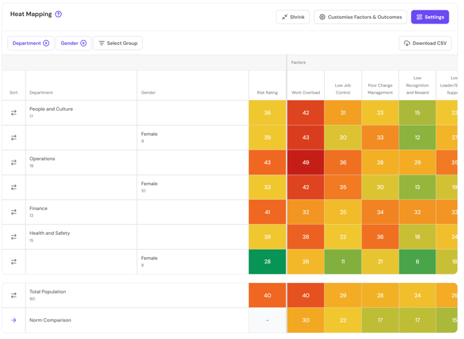
The heatmap shows the exposure score per hazard for each group within the demographic category. Use the scroll bar to move across the table. Outcomes are presented on the right side of the table. Norm comparisons (where available) are displayed at the bottom of the table.
Use the Shrink button to reduce the amount of text in the cells and increase the number of hazards visible within the window. The Expand button will revert back to the original view.
Use the Sort column to sort by hazard exposure score for a particular group. You can sort high to low or low to high.
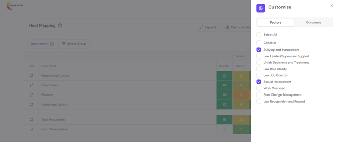
Use Customise Factors and Outcomes to select the hazards visible on the heatmap.
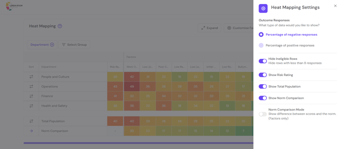
Use Settings to further customise your heatmap.
Return to How do I interpret my FlourishDx work factors risk assessment results?
Up Next: How do I interpret my FlourishDx work factors risk assessment Work Factors tab?