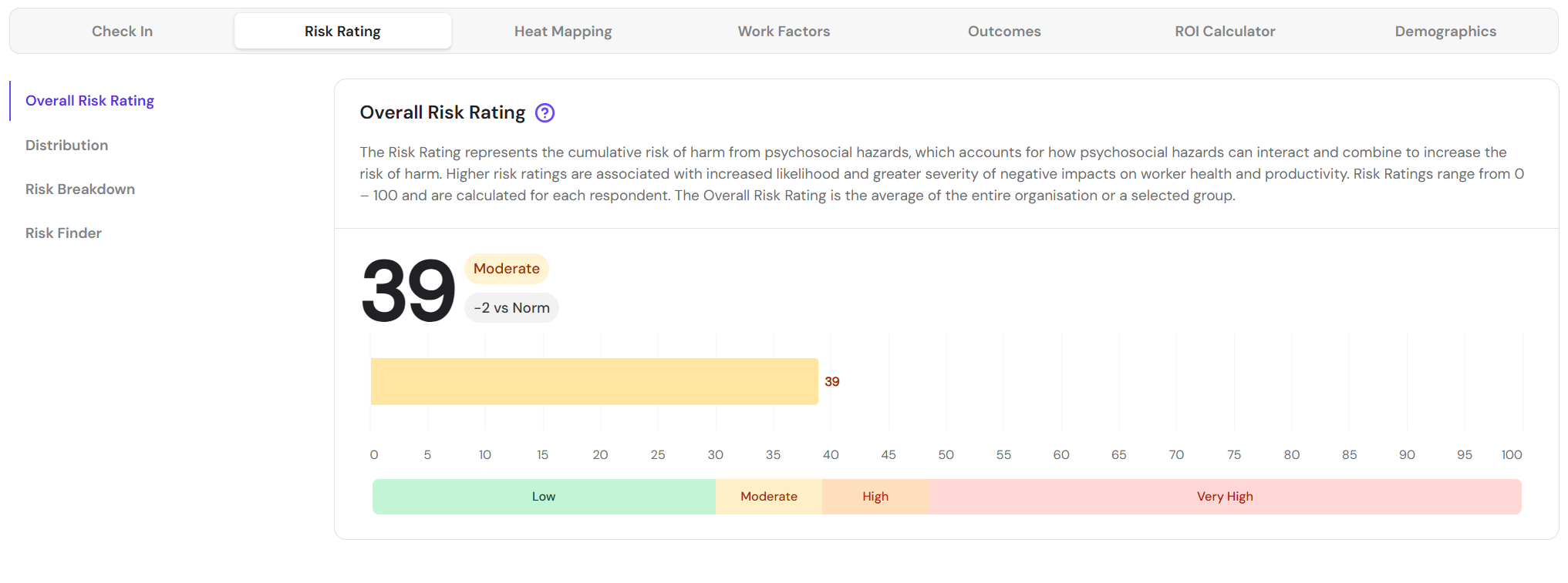
The Risk Rating tab presents aggregated risk scores in several visualisations accessed via the sub-menu on the left side of the dashboard.
The Overall Risk Rating is aggregated from the risk scores of each respondent in the group. Individual risk scores capture cumulative hazard exposure and are calculated by combining hazard exposure scores from several of the respondent's top-scoring hazards (more information on scoring is available here). Filters can be applied to view risk scores for different groups.
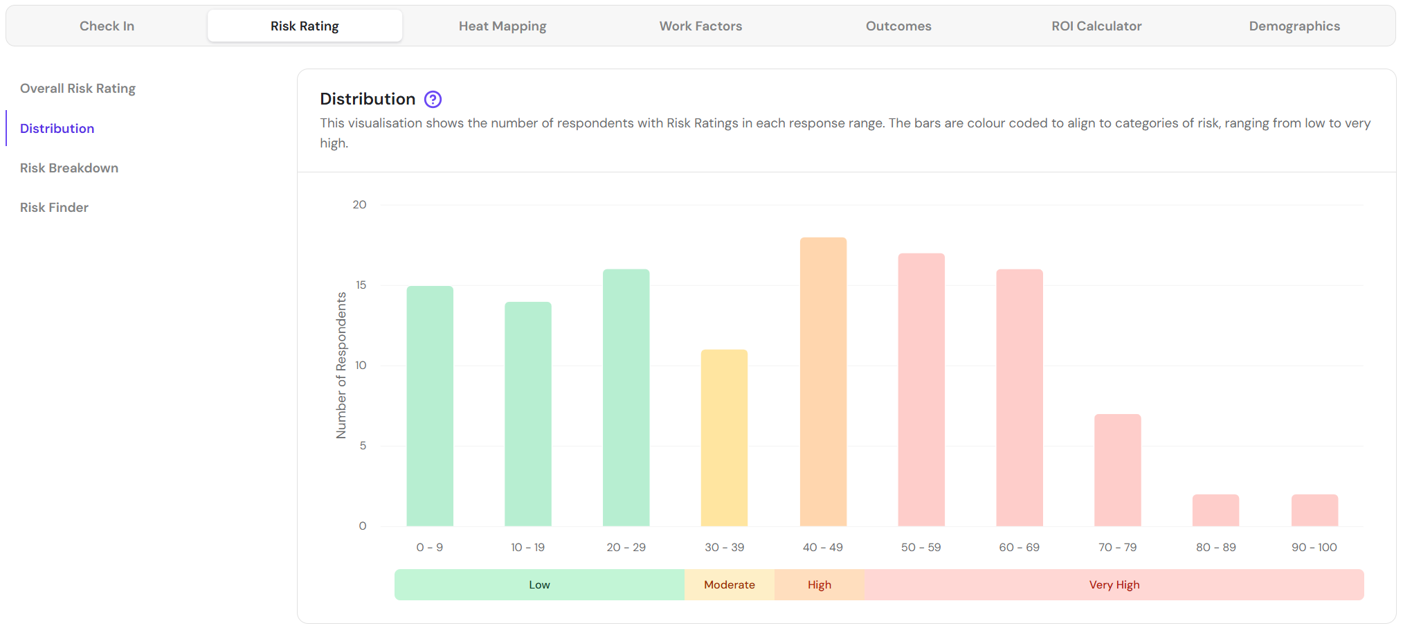
The Distribution visualisation shows the number of respondents with risk ratings in each response range. Filters can be applied to view distributions within different groups.
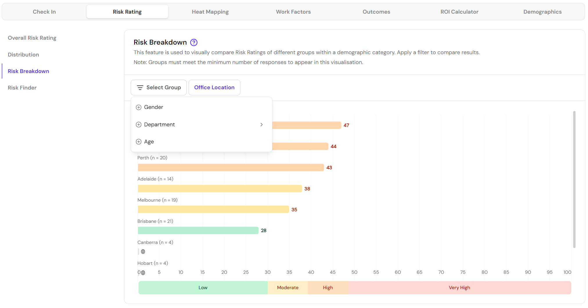
The Risk Breakdown visualisation shows group risk ratings ranked from high to low. This visualisation is useful for identifying priority areas for follow-up. Where fewer than 8 responses have been received for a demographic category, data will not be available.
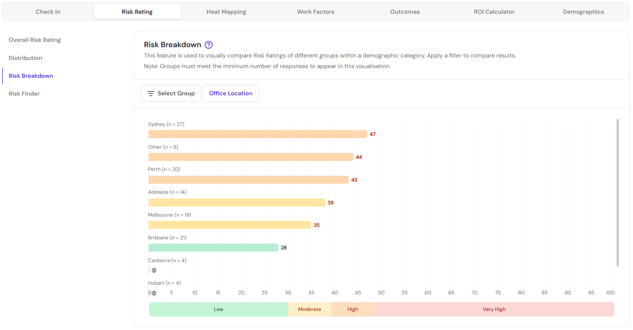
Apply the visualisation filter to change the demographic category in use.
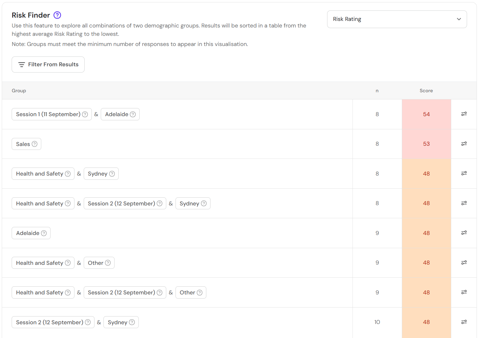
The Risk Finder calculates the risk scores of every possible combination of demographic categories and ranks them from highest to lowest.
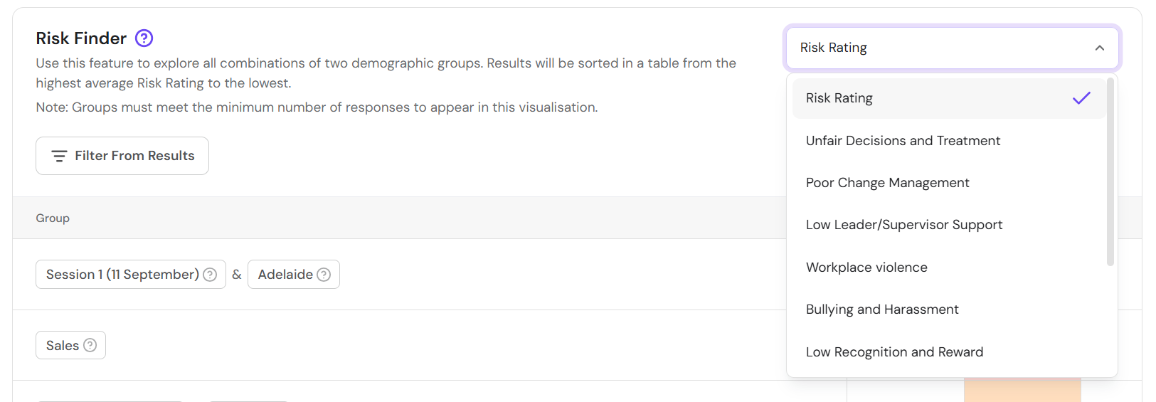
Choose to view ranked scores for individual hazards using the dropdown.
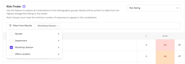
Remove filters from the results to provide more actionable results.
Return to How do I interpret my FlourishDx work factors risk assessment results?
Up Next: How do I interpret my FlourishDx work factors risk assessment Heat Mapping tab?